

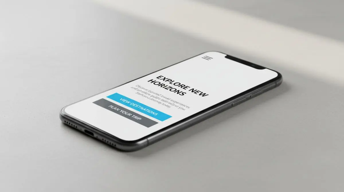
Mobile visitors make fast decisions with limited screen space, variable connections and constant distractions. When a site is not built for small screens first, small frictions stack up and people leave before they buy, book, or contact you.
This guide breaks down the most common mobile-first design failures that quietly reduce conversion rate, trust and search visibility. Each section focuses on what goes wrong and what to do instead.
Confusing Mobile Navigation And Hidden Paths
Mobile navigation fails when key pages are buried behind vague icons, nested menus, or tap targets that are too small. Users abandon when they cannot predict where a tap will take them or cannot quickly return to what they were doing.
Keep the navigation short, readable and touch-friendly. Prioritize the primary actions people want on mobile, then reduce everything else.
- Use clear labels. Replace ambiguous icons with text labels when space allows and avoid jargon.
- Keep tap targets large. Buttons and menu items should be easy to hit without zooming or precision.
- Limit menu depth. Too many sub-levels create dead ends and increase cognitive load.
- Make search easy to find. A visible search field or icon helps people shortcut navigation.
Once navigation is predictable, users move faster toward your offers and contact points.
Slow Page Speed From Heavy Media And Scripts
Speed is one of the quickest ways to lose mobile customers. Large images, autoplay video, excess trackers and bulky JavaScript can delay first interaction and make scrolling feel laggy.

Performance work is often the highest return improvement because it reduces abandonment and improves engagement signals. Treat mobile load time as a product feature, not a technical detail.
- Compress and resize images. Serve responsive images and avoid shipping desktop-size assets to phones.
- Delay non-essential scripts. Defer analytics and third-party widgets until after core content is usable.
- Reduce layout shifts. Reserve space for images, ads and embeds so the page does not jump.
- Audit fonts. Too many font files increase requests and delay text rendering.
Faster pages feel more trustworthy and they give your content time to persuade before the user bounces.
Unreadable Typography And Poor Contrast
Mobile readability is not only about font size. Thin weights, low contrast, cramped line height and long paragraphs make content exhausting to scan on a small screen.
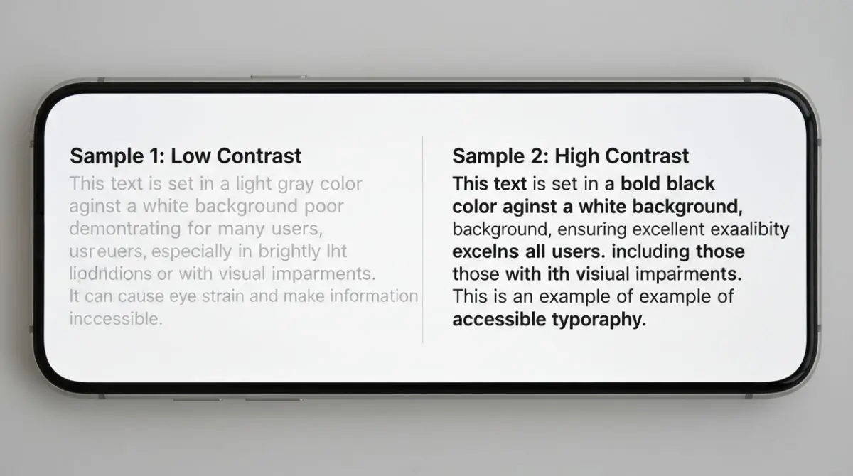
Good mobile typography supports skimming and quick comprehension. It also reduces mis-taps and form errors that happen when users zoom to read.
- Set comfortable line height. Air between lines improves scanning and reduces fatigue.
- Keep paragraph length short. Small chunks beat walls of text on mobile.
- Use strong color contrast. Light gray text on white backgrounds often fails in bright environments.
- Avoid tiny legal text. If it matters to the decision, it must be readable without zooming.
When the content is easy to read, users stay longer and absorb your value proposition.
Tap Targets Too Small And Touch Gestures That Frustrate
Desktop patterns like tiny links, dense lists and hover-based interactions do not translate to touch. If users frequently hit the wrong link or cannot open a menu reliably, they stop trying.

Design for thumbs and imperfect taps. A mobile interface should feel forgiving and stable even on one-handed use.
- Space interactive elements. Provide breathing room so taps do not trigger the wrong action.
- Use visible button styles. Links disguised as plain text reduce confidence and increase errors.
- Avoid hover-only features. Tooltips and hover menus should have a tap-friendly alternative.
- Prevent accidental dismissals. Modals and banners should not close when a user scrolls.
This reduces friction in the moments that matter most, such as product selection and checkout.
Intrusive Popups That Block Content
Popups are especially damaging on mobile because they consume most of the screen. When users cannot see content, cannot find the close button, or get interrupted before reading, trust drops quickly.

If you must use an overlay, make it respectful and easy to dismiss. Lead capture works better when it follows engagement rather than forcing it.
- Delay overlays. Allow users to view content first so intent can form.
- Make close controls obvious. A tiny X in the corner invites frustration and mis-taps.
- Use smaller banners when possible. Sticky bars take less space and can still drive sign-ups.
- Keep forms short. Fewer fields increase completion on mobile keyboards.
A less disruptive approach protects both user experience and conversion rate.
Forms And Checkout Flows Not Built For Mobile
Mobile forms fail when they ask for too much, use the wrong input types, or hide error messages. Checkout friction is even more costly because users are already motivated and close to purchasing.

Build forms that respect small screens and mobile keyboards. Remove anything that is not essential to the transaction or lead qualification.
- Use the right keyboard. Email fields should trigger the email keyboard and number fields should trigger the numeric keypad.
- Show errors inline. Put clear error messages near the field, not at the top of the page.
- Enable autofill. Proper labels and attributes speed completion and reduce typos.
- Minimize steps. Fewer screens and fewer fields reduce abandonment during checkout.
Mobile-friendly forms turn high-intent visitors into customers instead of drop-offs.
Desktop-First Layouts That Break On Small Screens
Many sites shrink a desktop grid and call it responsive. This creates cramped columns, awkward spacing and side-scrolling that signals low quality immediately.
True mobile-first design starts with the smallest viewport and builds up. It prioritizes content hierarchy, scannability and task completion before adding decorative elements.
| Mobile-First Check | What Goes Wrong | What To Do Instead |
|---|---|---|
| Single-column hierarchy | Side-by-side content becomes tiny and unreadable | Stack content with clear headings and spacing |
| Responsive images | Large assets slow load and cause layout jumps | Serve appropriately sized images and reserve space |
| Sticky elements | Headers and bars take over the viewport | Reduce height and hide on scroll when appropriate |
| Content priority | Secondary widgets push key info below the fold | Lead with value, social proof, then supporting content |
When layout decisions start with mobile constraints, the desktop version usually becomes cleaner as a side benefit.
Conclusion
Mobile-first website design is about removing friction where people are most impatient. Clear navigation, fast load times, readable content, touch-friendly interactions, respectful lead capture and mobile-built forms protect revenue.
Audit your site on a real phone using one hand and a typical connection. Fix the highest-impact blockers first, then iterate until every key path feels effortless.